Iran conflict and population redistribution
Iran conflict and population redistribution
What is this story about?
This interactive resource updates our situation report published in Reliefweb and organises it into a smaller set of visuals. It focuses on population displacement estimations, based on Internet traffic data, and the validation of these estimations using Wikipedia pageview data.
Our aim is to use digital trace data as an alternative way to measure likely population dynamics in near real time in Iran. Data sources typically used to monitor population displacement have been limited in Iran following the outbreak of war on 28 February 2026, due to existing sanctions, active hostilities, information controls and restricted humanitarian access. Here we graphically show our estimates of population displacement, which are based on Cloudflare Radar. Cloudflare publishes aggregated, anonymised counts of encrypted web requests passing through its network, broken down by province. They help estimate where the strongest relative shifts in population presence appear and how those shifts evolve through time
- The war-time population index is the core signal: it captures relative change in provincial presence against a pre-war baseline.
- The provincial maps and time series are the main evidence for geographic redistribution during the reporting period.
- TThe Wikipedia maps and time series serve as a contextual check.
How should these graphics be read?
The provincial war-time index is a relative measure of population displacement. Positive values suggest higher presence than the pre-war baseline, while negative values suggest lower presence. However, this index should be interpreted with caution, as it can also be influenced by Internet connectivity conditions.
The Wikipedia evidence should also be interpreted cautiously. Pageview counts are small and partial, but they can still help check whether geographic and temporal patterns are consistent with those seen in the province index.
What does the war-time population index show?
How does the war-time population index vary over time? The maps show relative changes in war-time population index, which is intended to capture relative population presence with respect to the start of the war.
For example, at the beginning of the conflict we observe a relative population increase in bordering provinces, especially in the North of Iran.
The provincial time series show whether those shifts persist, consolidate or reverse as the reporting period continues.
What can we say about likely origin and destination areas? Provinces with sustained declines are more plausible candidates for out-movement, while provinces with repeated increases are more plausible concentration zones.
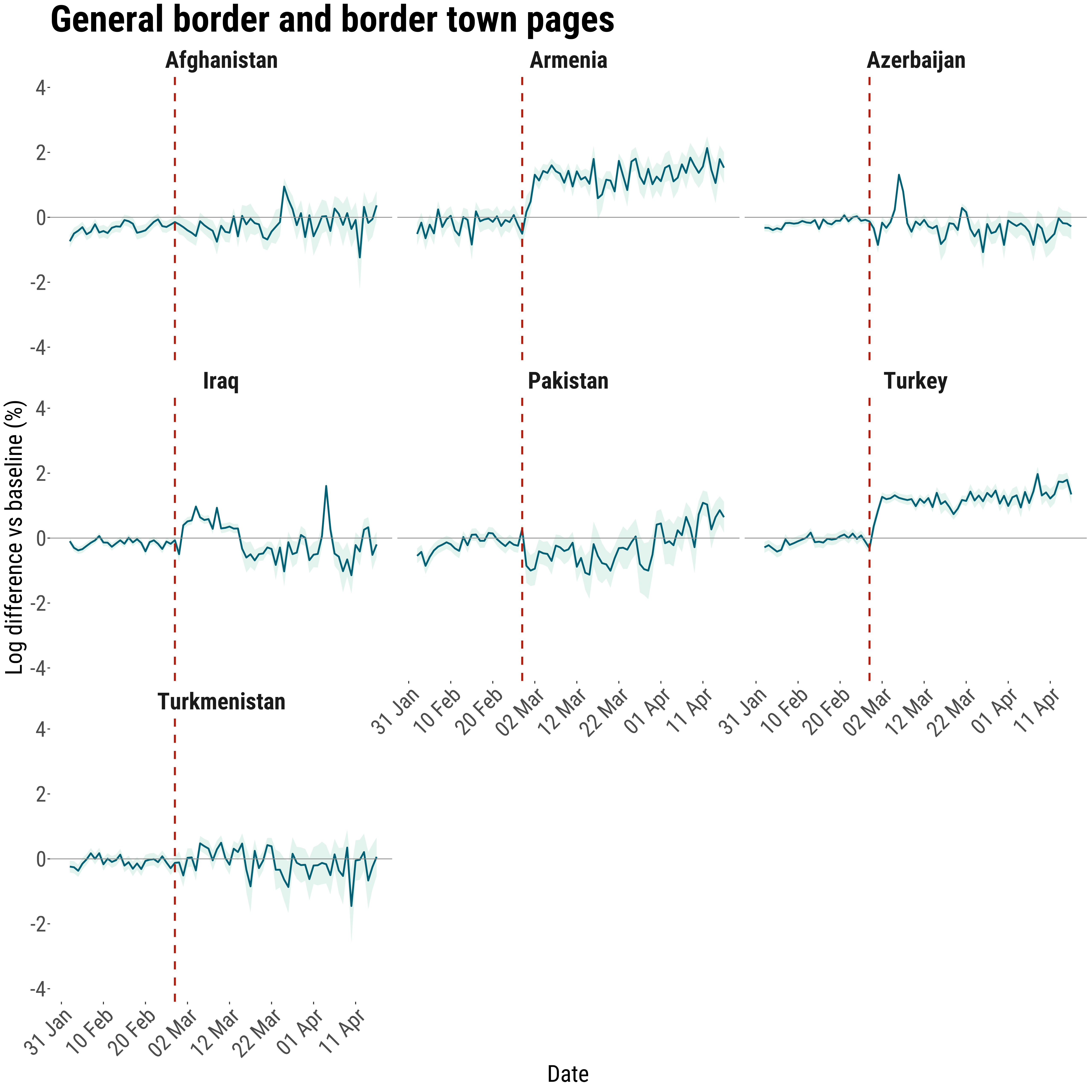
What do Wikipedia pageviews add to the story?
Data from Wikipedia page searches is used to check whether the patterns derived from Cloudflare data are consistent. It is intended to demonstrate whether another digital trace data source suggests the same geographic patterns of conflict attention and population displacement.
Alignment across signals from different sources strengthens confidence. It does not provide causal interpretations, but it does make the spatial story more persuasive than a single-source.
The time series then adds a timing check. If pageview attention rises sharply around the same phase of the conflict in which the province index shifts most strongly, that supports a common interpretation of disruption and reorientation.
Important limitations still remain: the signal is partial, the counts are small and the value of the series is contextual.
What should readers take away?
This simplified interactive resource focuses on the figures that carry the most interpretive weight. Further details can be found in the full report.
- The provincial maps and time series based on Cloudflare data are the core evidence for relative population redistribution during the reporting period.
- The Wikipedia maps and time series help assess whether another digital trace supports the same broad spatial and temporal patterns.
- The results are proxy evidence and should be read as signals rather than exact counts.